Mapping Queer Cinema

Tools
Next.js, React.js, Supabase, Figma, Tailwind CSS, Mapbox GLJS, Vercel
Context & Location
Senior Film and Media Studies Thesis @ Swarthmore College
Year
2025
ROLES
Solo Designer and Developer
LINKS


Where it started:
As an assignment for my World Cinema class, I rewatched Happy Together by Wong Kar-wai, a film I originally watched as a kid. The film follows Ho Po-Wing and Lai Yiu-Fai, two men from Hong Kong whose relationship unravels in Buenos Aires, the literal antipode of their home. Studying that geographic displacement in the film stuck with me. It felt like something I intimately recognized, the way that queer people often find themselves searching for places where they belong, places that feel like home even when home has rejected them.
I then thought about my experience with queer cinema as a whole. Growing up as a queer Vietnamese kid, the queer films that often get called “the canon”, Call Me by Your Name, Brokeback Mountain, never quite resonated with me. The films that actually did were scattered across different geographies across the world. When tasked with my senior thesis, I then started to wonder what it would look like if queer cinema was mapped by the people it actually touched.
The Guiding Question
In my studies, I learned that canons are acts of power. Boards sit around and decide what counts, what gets remembered, and what is “essential viewing.” Queer film canons have often been dominated by white western narratives which means a lot of queer people of color’s entry points into queer cinema go unrecognized. I wanted to build something that could hold a different kind of archive. Not a wholly definite list, but rather a community built living map made of personal encounters with film. An archive where someone in Manila could share a film that resonated with them, and someone in São Paulo could discover and find meaning in that same film. A living archive that, by design, would resist the kind of multicultural flattening that western canons tend to do.
In my ideation for this project, I was building on the theoretical framework I’ve studied in my film and media studies courses along with queer theory, specifically works on queer temporality, queer geographies, and disidentification. How do the spaces, both physical and digital, that queer people inhabit across the world contribute to our formation and perception of identity, and what role does the media we consume have on that?
What I Built:
Inspired by works like Queering the Map (https://www.queeringthemap.com/), Mapping Queer Cinema is a web-based interactive archive where users can browse and contribute to a global collection of queer film moments that touched them. The core interface is a 3D globe that users can spin, zoom into regions, and discover films pinned to different locations around the world.
Core Features:
Interactive globe built and visualized with Mapbox GL, allowing users to explore films spatially rather than through a traditional list.
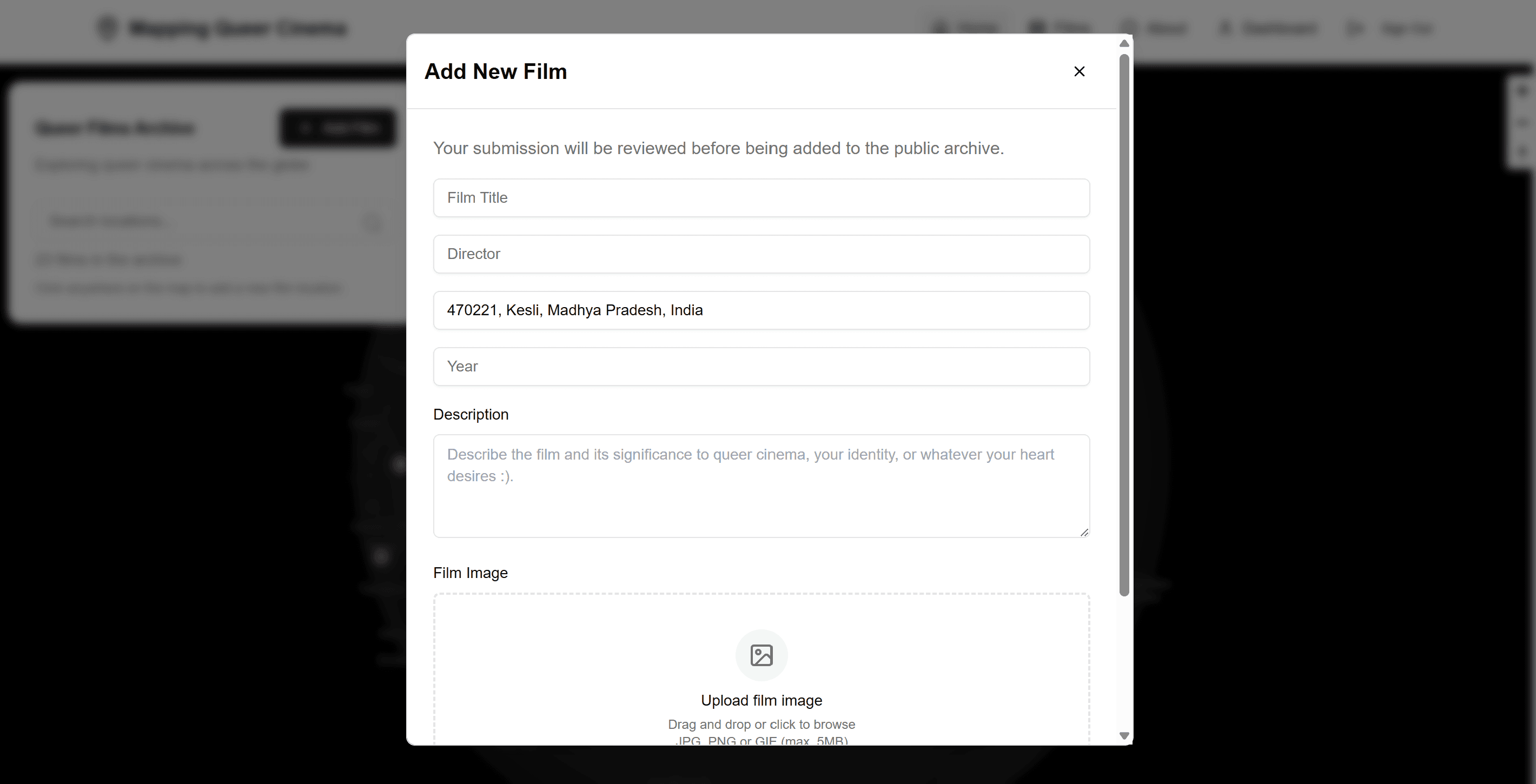
User contributions where authenticated users can pin a film to a location and share what it meant to them
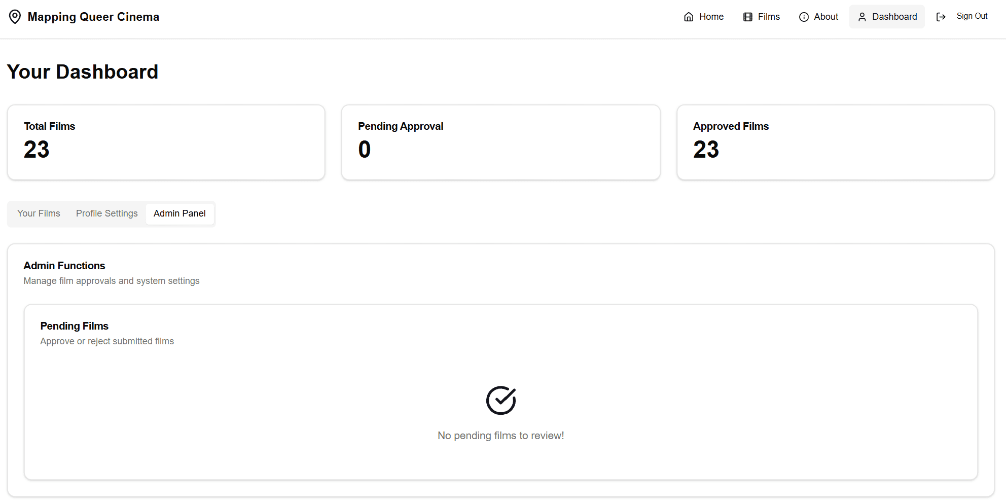
Admin moderation to review submissions before they go live (protecting against spam and hate while keeping the definition of "queer cinema" intentionally broad)
Dual navigation between map view and comprehensive list view, with the ability to filter by title, year, and location
User authentication via Supabase to enable contributions while maintaining accountability.
The Design Logic:
The globe as primary interface. A globe doesn't center any single geography. You land on it and have to choose where to look first. That felt right for a project trying to center many different personal narratives.
Requiring personal narrative. When you submit a film, you're not just logging metadata. You're asked to share your individual relationship to it—where you were (or where the film is set in), what it meant to you, and why it mattered. This is what distinguishes the project from a database. It's closer to Queering the Map than to Letterboxd. I wanted it to be more intimate to allow users to feel connected to one another, despite location, through shared identities and experiences.
Broad definition of "queer." I wanted the archive to include films that aren't explicitly LGBTQ+ yet meant something to queer viewers. Someone's queer awakening might have been through a horror movie, an anime, or a Bollywood musical. Driven by the idea of disidentification by José Esteban Muñoz, I wanted to also explore how queer people transform, or “queer”, dominant narratives to create our own meaning.
Technical Implementation
The stack:
Next.js for the frontend framework (App Router)
Mapbox GL JS for the interactive 3D globe
Supabase for authentication and the PostgreSQL database
Tailwind CSS for styling
Vercel for deployment
This was a pretty complex web-app for me to create as a solo project. I had limited exposure to backend, yet wanted to implement user authentication and create admin privileges to screen out potential hate and spam. Figuring out the authentication flow was the steepest learning curve for me. I also spent a large amount of time figuring out the information architecture. How should users navigate between the map view and list? What data should be visible at first glance versus on click? How do you make a globe feel inviting and browsable rather than overwhelming?


Reflections
While this project pushed me technically in ways I hadn't been pushed before, I also know where it falls short.
What worked:
The globe interface does what I wanted—it reorients how you encounter the archive
The contribution flow captures personal narrative, not just metadata
Authentication and moderation work as intended
What I'd do differently:
I was so focused on getting the technical pieces working that I didn't spend enough time on visual design and microinteractions. The UI is functional but not as polished as I'd like.
I'd love to add more ways to discover connections—maybe clustering films by theme, or showing relationships between submissions from the same user.
What I learned:
Building for community contribution is different from building a static site. You have to think about trust, moderation, and edge cases constantly.
Spatial interfaces have their own UX challenges. A map isn't automatically more intuitive than a list, it requires careful design decisions.
The project sits at the intersection of things I care about: film, technology, identity, and building experiences for people like me. It's also, honestly, still a work in progress. I learned a lot while building it, but I know there's more to learn and improve on, about design, about community, and about making interfaces that actually serve the people they're for. That's why I'm drawn to HCI as a field. I want to keep asking these questions, but with the tools for a more rigorous analysis.
Current State & Future Directions
The project was shared with Swarthmore's community and and my thesis advisors in May 2025. I received positive feedback on the concept and the interactive experience during the exhibition, though the archive is still small and with contributions mainly limited to Philadelphia residents.
If I continue this work, I want to:
Conduct more intentional user research with queer film communities to understand how people actually want to explore and contribute.
Improve the visual design and interaction patterns. Right now it's engineer-functional, but not designer-polished.
Explore how submissions might connect to each other: films that appear in multiple locations, trends in queer cinema across time, and geographic clusters of certain genres.
Think about accessibility more rigorously, particularly for screen reader users navigating a spatial interface.
Potentially partner with queer film festivals or archives to seed the database with curated content alongside user contributions.


